
It’s that time of year again. One day left to the 2017 Eurovision Song Contest grand final and I’m a bit excited.
That might sound odd. As in, it’s not the kind of topic I usually write about here. But the contest has a special place in my heart, as I explained about a year ago[1] in this article about what I, a dry academic type, love so much about this unsubtle glitter-fest. And considering my love for the contest, its complexity and its rich history I think a yearly article on it is going to be an Everything Studies tradition.
For this year’s entry I’m not going to profess my love for the fabulous spectacle and tell it’s recent history again. No, I’m going to break out the numbers. Everybody likes numbers.
Before I start, a quick rundown in case there’s anyone reading this that doesn’t know what the hell I’m talking about: the Eurovision Song Contest is a 60 years old televised music competition where European (with a few exceptions) countries each send a music act to perform in a tv show, and then each country gets to vote for their favorites. In the past national juries did the voting but for the last 15-20 years viewers have been able to vote by phone. Each country gives 1-8, 10 and 12 points[2] to their top ten, and most points in the end wins.
I mentioned in last year’s article that voting blocs/alliances are an integral part of the game. And believe it or not, this has been studied. Derek Gatherer found in 2006 that mutual backscratching relationships over and above what could be justified by merit or chance does happen and grew more common and more complex between 1990 and 2005:
[T]he period since the mid-90s has seen the emergence of large geographical voting blocs from previously small voting partnerships, which initially appeared in the early 90s.


Gatherer says it’s hard to know why it started to happen at this particular time, and rejects a common explanation for voting blocs — that countries close to each other vote for each other because they are culturally similar and therefore have similar tastes. He says if this was the case it would’ve been noticable earlier.
I’m not so sure. Voting by small juries is a lot more noisy than aggregating the opinions of thousands to millions of tv viewers, so the underlying patterns may have been lost in the noise or statistically unobservable without more data.
With televoting (televoters are more cliquish than juries) and more countries joining the contest it becomes easier to achive statistically significant effects, plus lots of new entrants from eastern Europe made cultural tastes more diverse than before, making such effects more noticeable. Taken together I think these points make Gatherer’s observations compatible with similar tastes as a primary driver of bloc voting[3].
I couldn’t find any similar studies looking at the last ten years, sadly, even if there is a lot of scholarship on the contest. What I also couldn’t find was any attempt at quantitative analysis of voting blocs as “cultural taste communities” rather than strategic alliances (besides a few blog posts like this one that uses a similar approach to mine but only with data from a single year, which is too noisy). When studying voting patterns, most focus on relationships defined by mututal points-exchanging rather than general voting similarity.
So let’s look at that. I’m going to use the same method as in my by far most popular article Varieties of Black Mirror Appreciation and do a Principal Component Analysis. That time I used Black Mirror episode ratings scraped from Reddit to find the major patterns in how tastes vary. This works the same way, data wise[4].
•
The following section is about methodology and how the data analysis works. If you don’t care about that and just want to see the end results, skip to the part titled “The Eurovision Song Contest taste landscape”.
I copypasted all the country-to-country scores (final only) from 2005 to 2016 into a single data file. The data matrix has a column for each country — minus a few that hasn’t been in and voted in enough contests (Australia, Slovakia, Monaco, Andorra, and the Czech Republic), leaving 43 countries. It has a row for each song qualified for a final since 2005, 303 songs in total. In each cell is the number of points the country in that column gave the song in that row.
We should compensate for the fact that even if two countries would like to vote exactly alike, they can’t, because a country can’t vote for itself. For example, Sweden never votes for Sweden even if it really really wants to, but Norway often does and this makes their tastes appear more different than they are. I fixed that by assuming each country would give its own song top marks if it could. So if two countries vote the same way with their 1-10 scores and then give their 12-pointers to each other, their data is identical.
In Varieties of Black Mirror Appreciation I explained principal component analysis this way:
What PCA does is to take a multidimensional data set (this set has 13 dimensions, one for each episode) and retain as much as possible of the variation in the set while reducing the number of dimensions by creating complex properties (“principal components”) that consist of weighted combinations of the raw dimensions. It’s technical, requires quite a bit of “data analysis literacy” to really get and hard to explain properly without pictures and way more than one paragraph. What it does, in layman’s terms, is look at all relationships at once and try to find the underlying axes along which the data varies the most.
I’m going to elaborate on that a little here (it’s fine to skip ahead to the next subsection if you don’t care about how PCA works and what the numbers mean). In this case we have 43 variables (countries) and 303 data points (songs). These 303 data points can be plotted in a 43-dimensional space, forming a point cloud. But that’s incomprehensible and we need to simplify. What we do is view correlations between variables (countries voting similarly) as arrows pointing in similar directions[5].
Look at this picture:

Arrows representing correlated variables point roughly in the same direction, anticorrelated variables point in roughly opposite directions and uncorrelated variables are roughly perpendicular (note that this isn’t a “mathematically correct” image in any way, just an illustration to aid intuition). Now we simplify by replacing this set of arrows with a single arrow while trying to lose as little information as possible. It would look something like this:

We construct this new arrow by making it a weighted average (with positive and negative weights) of all the others. The green arrows are positively correlated (gets positive weights) with the new axis, the orange ones are negatively correlated with it (gets negative weights), and the grey ones are not particularly correlated at all (gets weights close to zero).
Back to the real data. We find the biggest, thickest bundle of arrows and replace it with a single axis in this way, and then repeat the procedure by finding the biggest, thickest bundle that’s perpendicular to the first. We do this until the 43 original arrows have been replaced by 43 perfectly uncorrelated ones. Now we’ve ”rephrased” our data. Or strictly speaking, changed the shape of space to match the data (which sounds much cooler).
Why do this? Well, you rarely if ever use all your new axes, because unlike in the original set the new axes are not equally important in accouting for variation. Because the biggest, thickest bundles are taken care of first, the new axes get less and less important as the procedure goes on. Usually we make do with only the first few and discard the rest.
•
My first attempt didn’t go as planned. It turns out that taste is (shockingly) not totally arbitrary. Some songs are better than others (by popular judgment) and everyone is, to some degree, more likely to vote for those. The first axis I got was simply a representation of all arrows slightly agreeing on which songs were better[6]. This is a simple consequence of some songs getting more points in total.
But I’m interested in the differences, in the particular taste of each country. So I subtracted the average score each song got, making the data reflect not how many points each country gave each song, but how many points more or less than average they gave.
This time I found two about equally important main components. They account for 13 and 12 percent of all the variation, respectively. This shows there is structure here; if it was all random noise each new axis would account for only 100/43, or about 2.3 percent. In geometric terms: with random variation the point cloud would look like a fuzzy ball, instead it looks like a thick disc. A 43-dimensional thick disc.
This is the first axis:
| Estonia | 0,631 |
| Latvia | 0,601 |
| Iceland | 0,559 |
| Ireland | 0,546 |
| Denmark | 0,527 |
| Finland | 0,495 |
| Norway | 0,483 |
| Lithuania | 0,458 |
| Sweden | 0,371 |
| Poland | 0,282 |
| United Kingdom | 0,246 |
| Portugal | 0,196 |
| Belarus | 0,115 |
| Malta | 0,094 |
| Israel | 0,090 |
| Hungary | 0,064 |
| Spain | 0,063 |
| Ukraine | 0,052 |
| Moldova | 0,048 |
| Russia | 0,005 |
| Georgia | -0,035 |
| The Netherlands | -0,042 |
| San Marino | -0,057 |
| Germany | -0,076 |
| Italy | -0,094 |
| Belgium | -0,129 |
| Romania | -0,139 |
| France | -0,164 |
| Azerbaijan | -0,165 |
| Armenia | -0,188 |
| Slovenia | -0,250 |
| Austria | -0,265 |
| Cyprus | -0,281 |
| Switzerland | -0,303 |
| Greece | -0,371 |
| Serbia | -0,393 |
| Croatia | -0,447 |
| Bulgaria | -0,462 |
| Turkey | -0,469 |
| Montenegro | -0,481 |
| Albania | -0,485 |
| Bosnia & Herzegovina | -0,618 |
| Macedonia | -0,641 |
It gives positive weights to the Baltic states + Poland, the Nordics and the UK and Ireland, while being anticorrelated with most ex-Yugoslav countries and their neighbors around the eastern Mediterranean. This matches my preexisting beliefs, namely that the Balkans and the Nordic-Baltics are both blocs and don’t agree on much, musically. Call it North vs. South, if you will.
The second one looks like this:
| Belarus | 0,722 |
| Ukraine | 0,720 |
| Russia | 0,706 |
| Moldova | 0,612 |
| Georgia | 0,600 |
| Azerbaijan | 0,541 |
| Armenia | 0,541 |
| Israel | 0,395 |
| Lithuania | 0,296 |
| Cyprus | 0,276 |
| Greece | 0,264 |
| Bulgaria | 0,187 |
| Poland | 0,154 |
| Latvia | 0,127 |
| Romania | 0,120 |
| Malta | 0,095 |
| Portugal | 0,078 |
| Turkey | 0,071 |
| Spain | 0,059 |
| Estonia | 0,033 |
| San Marino | 0,013 |
| Italy | -0,034 |
| Hungary | -0,043 |
| Montenegro | -0,093 |
| Ireland | -0,147 |
| France | -0,168 |
| Belgium | -0,174 |
| Albania | -0,187 |
| United Kingdom | -0,189 |
| Serbia | -0,239 |
| Macedonia | -0,248 |
| Croatia | -0,305 |
| Austria | -0,333 |
| Finland | -0,351 |
| Germany | -0,356 |
| Iceland | -0,374 |
| Bosnia & Herzegovina | -0,394 |
| The Netherlands | -0,416 |
| Slovenia | -0,458 |
| Norway | -0,474 |
| Denmark | -0,502 |
| Sweden | -0,537 |
| Switzerland | -0,552 |
Well, this is pretty obvious. It’s got all the ex-Soviet states at one end, and a more eclectic we’re-not-the-Soviet-Union club at the other. If the first had a vague North-South feel this has an even vaguer East-West feel.
The next axis only explains about 7% of the variation, roughly half as important as these. It’s also not as easily interpreted, so I thought making a plot showing the combination of the first two was more interesting than looking at more axes.
So, without further ado:
The Eurovision Song Contest taste landscape
If we put the first dimension on the Y axis (as is fitting for something vaguely North-South) and the second on the X axis (fitting for something vaguely East-West), we get this picture (dot sizes reflect total points received during the period):
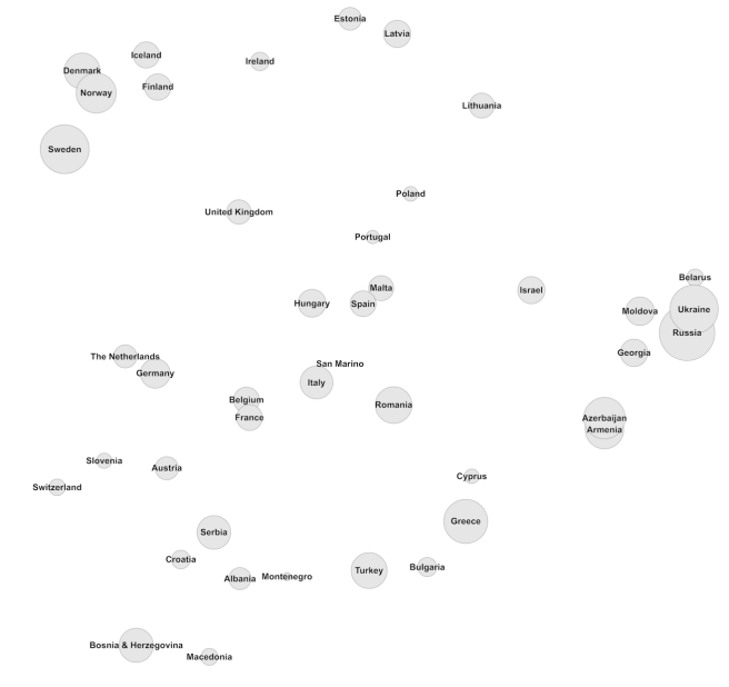
Cool. Don’t some things just pop out at you? The tightly knit ex-Soviet group to the right, the Nordic gang in the top left corner and their Baltic brethren on the right? The Baltic countries are even in the right order(!) with Poland in a geographically appropriate position south of them. Greece, Cyprus, Turkey, Bulgaria and Romania are close, as are the former Yugoslav countries. There is even a group of romance language speakers in the middle.
Sure, there are a few oddities. Why is Slovenia hanging out with the germanic-speaking clique[7]? And Ireland appears to be located in the middle of the Baltic sea? But there are some extra neat stuff too, like Romania being the bridge between the romance speakers and the east Mediterranean/Black Sea group, and France and Belgium hanging out right between the Romance and Germanic heartlands. It would’ve been just a little bit more perfect if Belgium was placed right between France and the Netherlands, but you can’t get everything.
I can’t account for the positions of Hungary and Israel (and why Poland and Portugal are so close[8]). Why does Hungary vote like Spain and Malta (I think I expected them to be somewhere between Austria and Croatia…)? And why is Israel closer to the ex-Soviets than to the rest of the east Mediterraneans? It’s probably not because of lingustic differences; Turkish, Greek, Bulgarian and Romanian are all in different language families.
But all in all, I found something close to what I expected and it was great to get to see it. To add flavor I gave the clusters some cute names and made another picture:
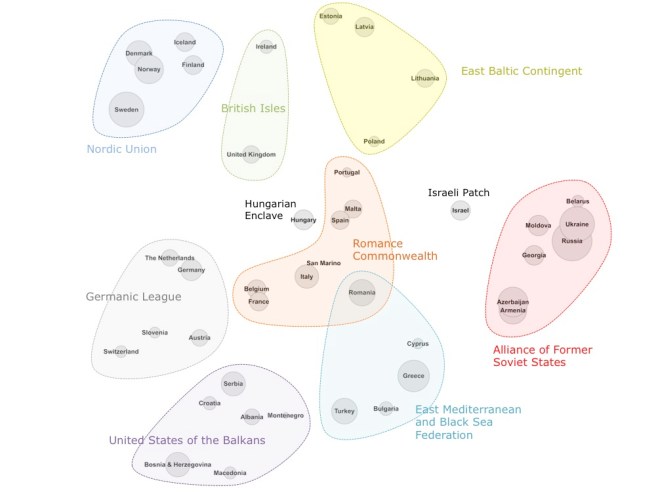
The results show that voting clusters are indeed still a thing more than a decade after 2005 (although nobody doubted that), and more importantly that looking at overall tastes and not just reciprocal alliances reveals that the “similar tastes and culture” hypothesis as an explanation of regional or political[9] voting holds water.
That doesn’t mean outright bias doesn’t exist — Cyprus and Greece do need to get a room and considering how similar political enemies Azerbaijan and Armenia‘s tastes are it kinda-sorta stands out just a teeny-weeny little bit that they don’t give any points to each other.
I suppose you could try to get at political biases by looking at whether countries vote for each other’s songs much more or much less than we’d expect based on how similar their tastes are. Maybe I’ll do that next year.
•••
[1]
Exactly a year ago if you define your calendar by ESC finals, which of course you should.
[2]
At least, this was the system from 1975 to 2015. In 2016 it was changed and televoters and professional juries gave separate scores instead of having them combined, i.e. two sets of 1-8, 10 and 12 points per country instead of one. This change doesn’t have much relevance to the rest of the article.
[3]
Even so, I totally get why this can be seen as unfair to large countries without a lot of culturally similar neighbors. On the other hand it’s hard to argue that anyone is obligated to do anything differently.
[4]
The meaning of the data is not exactly the same. In the Black Mirror case I was interested in the relationships between the episodes (using each voter as a data point) while in this case I’m interested in relationships between the voters (using each song as a data point). The data structure is the same, though.
[5]
Mathematically, the correlation between two vectors is identical to the cosine of the angle between them (if the vector components are normalized first).
[6]
What this dimension actually measured was the extent to which each country’s votes correlates with the final result — in essence how ”average” or ”in tune with everyone else” they are. This is an interesting statistic but not what I was looking for. It’s also somewhat misleading in this case because not all countries have voted in every final, and I replaced missing data with averages, meaning that countries participating fewer times will look more average in their taste than they really are.
[7]
It’s not as weird as it looks. Slovenia is at the north end of former Yugoslavia and borders Austria and the alps. Surely there must be significant cultural overlap there.
[8]
New theory: living in a country starting with ”po” affects your taste in music. More research is needed. Send funding.
[9]
”They don’t like us for political reasons” is often used as an explanation for why the UK tends to do badly. Their first “nul points” result in 2003 was thought by some to be a result of the Iraq war, for instance. I don’t find this particularly convincing, since Russia isn’t exactly universally popular but still manages to secure points from all over the continent.
Did you enjoy this article? Consider supporting Everything Studies on Patreon.

On Israel: about 20% of Israel’s population are Russian-speaking immigrants from the ex-Soviet bloc who arrived in the early 90’s. This explains a lot of other weird things, such as the remarkable coziness between the two governments even though Russia has supported all of Israel’s military opponents throughout the years and sold them most of their weapons.
Anyway – only 9 days to go!
LikeLiked by 1 person
Ha, I knew there was a reason 🙂 Looks like this graph makes even more sense than I thought.
Cool that you’re a fan too, btw. I’m looking forward to next week, hoping I get my yearly article done in time.
LikeLike